Project Overview
The Barber Lounge, a trusted local grooming brand rooted in Black barber shop culture and community, approached me to modernize their digital experience. Their existing site was dated, difficult to navigate, and underperformed in driving bookings and sales.
My goal was to redesign the website to:
Modernize the brand visually.
Improve navigation and usability.
Drive higher engagement and conversions.
The updated layout effectively reflects the brand's vibrant culture and commitment to excellence, providing a more engaging and user-friendly experience for visitors.
Discovery & Research
Understanding the Users
I began with stakeholder interviews and a demographic analysis of the Barber Lounge’s clientele:
Age: 20–40 years, a mix of military, students, and professionals.
Behavior: Frequent repeat visits; often browse on mobile devices.
Pain Points: Couldn’t find booking links easily, unclear pricing, too much scrolling to reach core content.
Competitor Benchmarking
I analyzed five competitor salon websites and found that successful sites emphasized:
Quick booking access above the fold.
Visual storytelling using authentic photography.
Simplified, single-path navigation to core actions.
This FigJam file outlines the project details, including user demographics, goals, and design strategies that guided the Barber Lounge website redesign. The visual planning in FigJam ensured a clear alignment with the client’s vision and the successful execution of the project.
Defining the Problem
The original Barber Lounge site suffered from:
Outdated, dark visuals that didn’t reflect the brand’s vibrant culture.
Linear structure with no clear conversion flow.
Weak CTAs and scattered service information.
Problem Statement:
How might we create an experience that is modern, easy to navigate, and designed around how real users explore, book, and engage with the brand?
The original homepage of the Barber Lounge website featured a dated design with a dark color scheme, lacking the visual appeal needed to represent the brand's vibrant personality.
The original "Join Us" and "Product" sections of the Barber Lounge website were text-heavy and visually unengaging, contributing to a poor user experience and lower conversion rates.
Information Architecture & User Flow
To align the site structure with user mental models, I reorganized the content into three primary pathways:
User Flow 1: Book a Service
Goal: Streamline the booking process.
Home → Services Overview → Stylist Detail → Book Appointment
Change: Surfaced booking CTA on every page and minimized scroll depth.
User Flow 2: Explore the Brand
Goal: Highlight the culture and people behind the brand.
Home → About → Meet the Team → Community Gallery
Change: Added storytelling modules with authentic photography.
User Flow 3: Purchase a Product or Membership
Goal: Drive online conversions.
Home → Products → Add to Cart → Checkout
Change: Improved CTA visibility and created product hierarchy for faster scanning.
The project goals outlined in this FigJam file helped guide the redesign process, ensuring that each objective was met effectively.
Design Process
Visual Design
With the wireframes and prototypes finalized, the next step was to bring the Barber Lounge’s brand to life through visual design. The key design decisions focused on creating a modern, inviting aesthetic that reflected the brand’s identity.
Color Palette: The color palette was carefully selected to balance tradition and modernity. I opted for a clean black and white base, which added sophistication and allowed the vibrant photography to stand out. Accents of deep reds and browns were used to evoke warmth and professionalism, aligning with the brand's image as a premium grooming destination.
Typography: I chose bold, modern fonts for the headings to create a strong visual hierarchy and improve readability. The font selections were intended to convey both confidence and approachability, resonating with the Barber Lounge’s diverse clientele. A more neutral, legible font was used for body text to ensure that content was easy to read across all devices.
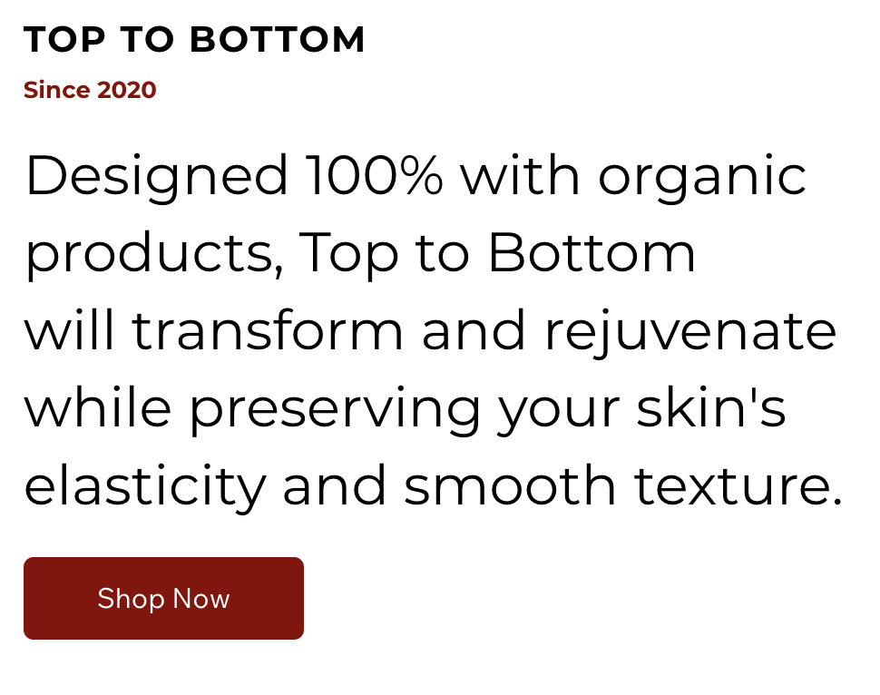
Imagery: High-quality, black-and-white photography was a focal point of the new design, used to showcase the team members and the unique atmosphere of the Barber Lounge. These images were chosen to reflect the brand’s roots in Black barber shop culture while also appealing to a broader, diverse audience.
Layout: The layout was designed to be dynamic and visually engaging, with large, full-width sections that guided users through the site. This approach helped to create an immersive experience that mirrored the
in-person environment of the Barber Lounge.
Utilizing the Wix CMS
The Barber Lounge had already established their online presence using Wix, a platform they were familiar with and wanted to continue using. My approach centered around optimizing the existing Wix CMS (Content Management System) to deliver a modern and engaging website that met the client’s needs without the need for complex wireframing or prototyping.
Customization within Wix: Instead of starting from scratch with wireframes or prototypes, I focused on customizing the existing Wix templates to align with the Barber Lounge’s brand identity. I leveraged Wix’s design tools to create a layout that was both visually appealing and functional, ensuring that the content was organized in a way that enhanced user experience.
Content Management: I streamlined the content within the Wix CMS, making it easier for the client to manage and update the site in the future. This included organizing text, images, and other media into sections that were intuitive and aligned with the site’s overall design. The use of Wix’s drag-and-drop functionality allowed for efficient design updates and ensured that the final website was both user-friendly and easy for the client to maintain.
Responsive Design: I also took advantage of Wix’s built-in responsiveness features to ensure that the site looked great on all devices, from desktops to mobile phones. This was crucial in providing a consistent user experience across various platforms, catering to the diverse audience of the Barber Lounge.


Fun fact - I did all the photography for this project as well. :)
The bold typography used in the redesign enhances readability and helps create a strong visual hierarchy, guiding users through the content with ease.

The Wix CMS dashboard, where content and design were managed, allowed for efficient updates and ensured the final website was easy for the client to maintain.
Final Design & Outcome
Visual Comparison
The transformation of the Barber Lounge website is best illustrated through a direct visual comparison of the "before" and "after" designs:
Before: The original website featured a traditional, somewhat outdated layout with a dark color scheme, minimal imagery, and a linear content structure. It lacked visual engagement and failed to effectively convey the brand's modern, vibrant personality.
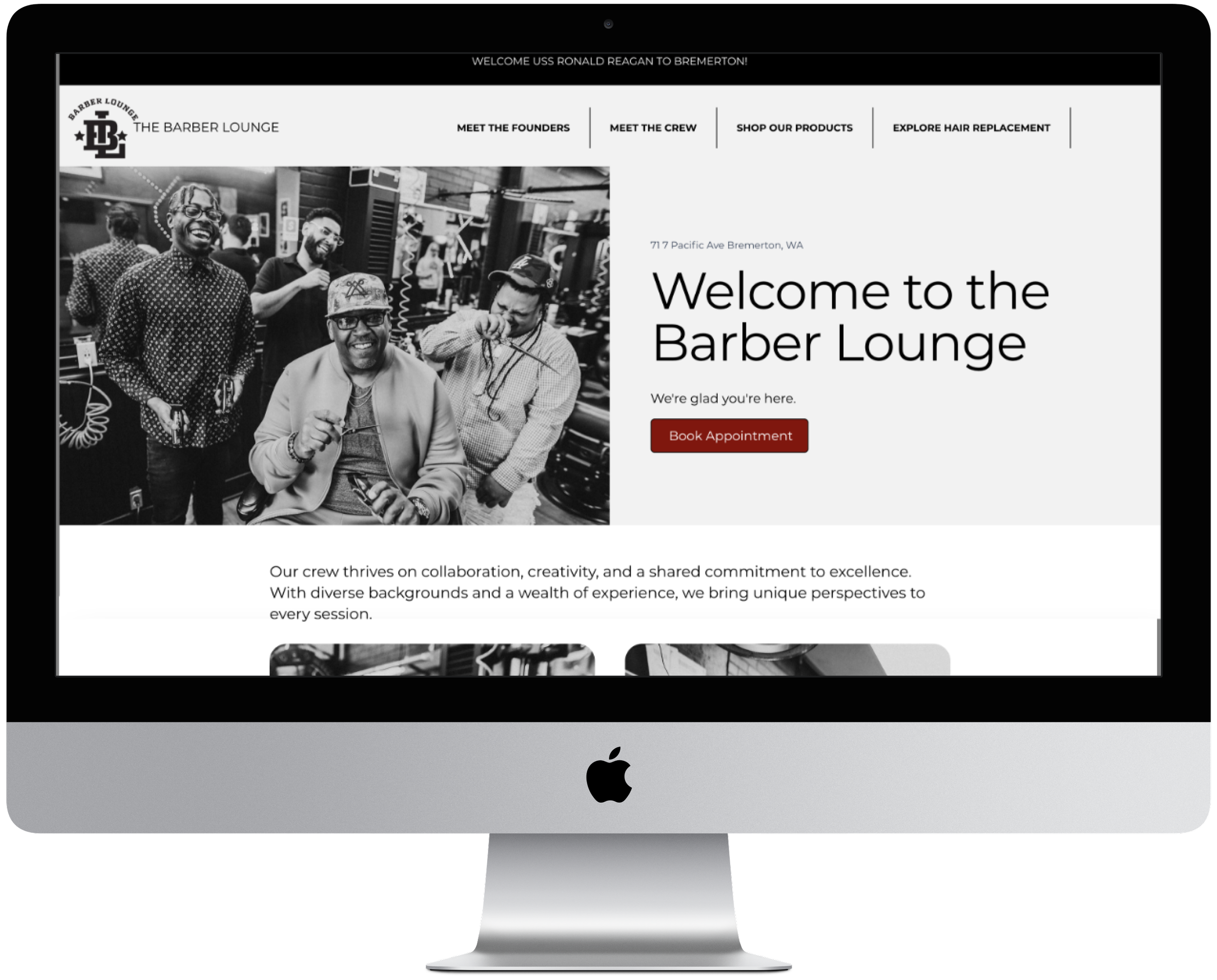
After: The redesigned website boasts a clean, modern aesthetic with a dynamic layout, enhanced by bold imagery and a cohesive color palette. The new design aligns closely with the Barber Lounge’s brand identity, reflecting its roots in Black barber shop culture while appealing to a diverse audience. The improved content flow, along with strategically placed call-to-actions, has created a more engaging and user-friendly experience.
The original design featured a dark-themed homepage with minimal imagery, a basic call-to-action, and significant wasted space, resulting in a dull and uninviting user experience.
The updated homepage maximizes space with vibrant imagery and impactful content, creating a welcoming atmosphere that better reflects the Barber Lounge’s brand and engages visitors effectively.
Reflection
Lessons Learned
Throughout the Barber Lounge website redesign project, several key challenges arose that provided valuable learning experiences:
Working Within Platform Constraints: One of the primary challenges was working within the limitations of the Wix platform. While Wix offers user-friendly tools, it also has constraints that can limit design flexibility. Overcoming this challenge required creativity in using the available tools and finding alternative solutions to achieve the desired design outcomes. This experience reinforced the importance of adaptability and problem-solving when working within predefined constraints.
Balancing Client Preferences with Best Practices: The client’s preference for continuing with Wix meant that certain advanced design and development techniques had to be adapted or simplified. Ensuring that the final product met both the client’s expectations and industry best practices was a delicate balance. This taught me the importance of clear communication and setting realistic expectations while still striving to deliver a high-quality product.
Emphasizing User Experience: Another insight gained was the significance of user-centered design, especially in a service-oriented business like the Barber Lounge. The positive feedback from users highlighted how crucial it is to prioritize ease of use, visual appeal, and functionality. This project reaffirmed my commitment to always considering the end-user's needs and preferences in any design work.
The Wix dashboard played a crucial role in managing the content and design elements during the Barber Lounge website redesign, allowing for efficient updates and customization within the platform's constraints.