
Before: The color scheme lacked harmony, inconsistent text, and outdated elements.

Quickbase is renowned for its application platform that simplifies the management of complex work at an enterprise scale. However, the web application suffered from a lack of visual harmony, inconsistent text usage, and outdated design elements. This misalignment not only affected the user experience but also the brand's professional appearance.
Before: The web application showcased a mix of old and new design elements, leading to a disjointed user experience. The color scheme was inconsistent, and there were varying interaction patterns across different pages.
Project Details
Client: Quickbase
Project Duration: Contracted March 2023 to June 2023
Role: UX Designer
Team: Project Managers, Content Designers, and Engineering Team


“Quickbase is the first application platform built for dynamic work, where it’s easy to see, connect, and control your most complex work at enterprise scale. - Quickbase Website”
Research and Familiarization
Studied the existing design system and its atomic design principles.
Analyzed outdated pages for inconsistencies and design gaps.
Collaborated with project manager and content designers to understand user pain points.
Aligned with team members on project goals and requirements.
Collaborated with the engineering team to understand technical specifications and feasibility.
Created new atomic design elements that followed design system guidelines.
Quickbase embarked on a web application repaint project from March 2023 to June 2023, with the goal of updating outdated pages to align with their new design system. The project aimed to address visual inconsistencies and outdated elements, thereby enhancing the user experience. This case study outlines the process and methodologies employed by the UX design team to achieve a refreshed, cohesive web application design.
“Aesthetically pleasing interfaces are worth the investment. Visual designs that
appeal to your users have the side effects of making your site appear orderly, well
designed, and professional. Users are more likely to want to try a visually
appealing site, and they’re more patient with minor issues. ”
Intro

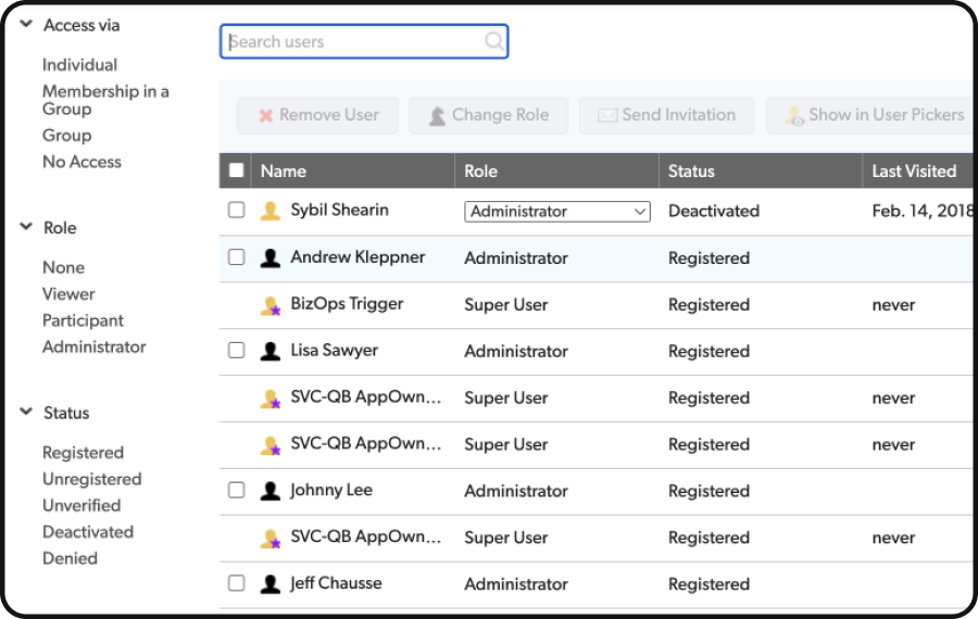
After: Refreshed design with improved typography, modern icons, and organized tables.
Visual Design and Iteration
Utilized Figma for high-fidelity mockups, incorporating new atomic elements.
Iterated designs based on team feedback.
Collaborated with content designers for content integration.


Before: The web application showcased a mix of old and new design elements, leading to a disjointed user experience. The color scheme was inconsistent, and there were varying interaction patterns across different pages.
Problem Statement
The challenge was to update the existing web application's outdated pages to adhere to the updated design system. These pages lacked visual consistency, had varying interaction patterns, and required a revamp to provide a unified user experience.
Approach
The challenge was to update the existing web application's outdated pages to adhere to the updated design system. These pages lacked visual consistency, had varying interaction patterns, and required a revamp to provide a unified user experience.
Collaboration and Component Creation


Prototyping and Validation
Developed interactive prototypes using Figma and Axure.
Conducted internal usability testing to validate design changes.
Handoff and Implementation
Prepared detailed design specifications for engineering.
Collaborated closely during implementation, ensuring design fidelity.
Conducted design reviews with the engineering team.

Results
Revamped multiple older pages, achieving visual consistency and a cohesive user experience.
Enhanced usability, aesthetics, and brand alignment of the web application.
Smooth design and development process facilitated by effective remote collaboration.
After the Repaint
Improved typography and modern icons contributed to readability and visual appeal.
Organized tables and clear page titles enhanced user orientation.
A contemporary and intuitive user interface was achieved through the redesign.
Key Learnings
Balancing technical specifications with design principles is crucial for creating new atomic elements.
Effective collaboration and communication are essential for successful project outcomes.
A deep understanding of atomic design principles is necessary to adapt existing design systems for consistency and scalability.
The Quickbase repaint project not only refreshed the web application's appearance but also set a precedent for future design projects, demonstrating the value of systematic, collaborative, and user-centered design approaches.